One Page Websites – The Best Templates and Examples [2023]
- What is a one-page website?
- When do you need a single-page website?
- 3 One-page website examples
- 4 One-page website template
- 8 Features of single-page websites
- Conclusion
What is a One-Page Website?
One-page websites, also known as single-page websites or one-pagers, are websites that consist of only a single web page.
Unlike traditional multi-page websites with multiple interconnected pages, a one-page website presents all the content and information on a single, long-scrolling page. When visitors access the website, they can navigate through different sections of the page by scrolling vertically or by using navigation links or buttons.
When Do You Need a Single-Page Website?
A single-page website consolidates all essential details and content into a single location. It encompasses vital elements like company information, customer testimonials, product descriptions, pricing information, and a contact form.
Despite their apparent limitations, one-page websites find utility in various business domains, including restaurants, cafes, software development companies, small agencies, and more. They are also well-suited for promoting awareness campaigns and events.
Consider these additional scenarios where a single-page website is suitable:
- Simplified Online Presence for Physical Stores: Physical stores or outlets can opt for a simple one-page website to establish their online presence.
- Single Product or Service Promotion: If you have a single product or service to promote and sell, a one-page website can effectively highlight its features and facilitate conversions.
- Showcasing Artistic or Freelance Work: Artists or freelance professionals can present their portfolios and relevant information on a single page.
By organizing the content in a concise manner, a single-page website enables users to locate desired information swiftly. For instance, a restaurant website can offer menu access and reservation options without requiring visitors to navigate through multiple pages. All necessary actions can be performed seamlessly within one location.
3 Examples of the Best One-Page Websites
1. Roma – Domestic Workers

Roma exemplifies a one-page website dedicated to raising awareness about the exploitation faced by domestic workers. Upon entering the site, users are welcomed by a captivating full-width image alongside a powerful statement.
The Roma homepage serves as an illustrative example of how a non-profit organization, charity, or social activism initiative can effectively utilize a one-page website.
The content above the fold features three essential links: one leading to the “Take Action” section on the page, an external link directing users to the Roma documentary on Netflix, and an anchor link guiding visitors to the subsequent section. This allows for convenient navigation to crucial content directly from the header.
As you continue scrolling, insightful snippets of information concerning domestic workers in the United States unfold before you.
Further down the page, prominent calls to action (CTAs) are prominently displayed, accompanied by links directing users to external pages where they can sign up and contribute to the cause.
2. Cook Collective

Cook Collective operates as a shared kitchen service, providing businesses in the food industry, including virtual restaurants and street vendors, with the opportunity to rent preparation stations and storage spaces. This comprehensive information is effectively conveyed through a one-page website.
The Cook Collective website serves as a prime example of a single-page website showcasing a rental service. Its menu, located at the top, facilitates easy navigation to various sections on the page. Within these sections, visitors can explore detailed insights about the company, its offerings, and the partners it has collaborated with.
Moreover, the same page features a convenient booking and information request form, streamlining the process for interested parties.
This single-page website example demonstrates that promoting a service doesn’t necessitate overwhelming the site with extensive content. By employing a single page with well-defined sections, you can succinctly present a brief company biography, highlight the key features of your service, and provide users with the means to connect and make inquiries.
3. We Ain’t Plastic

We Ain’t Plastic showcases its previous UX works on a one-page portfolio website.
This page serves as an illustrative example of a one-page website dedicated to a UX engineer’s portfolio. Its design embodies a sleek and minimalist aesthetic, complemented by a menu that facilitates navigation to distinct sections within the page, including the portfolio.
Visitors have the opportunity to explore various examples of the UX engineer’s work seamlessly within the page itself. By clicking on a specific project, the page dynamically loads additional details about it, along with an external link redirecting users to the corresponding website.
Furthermore, the website presents a well-organized list of awards, features in publications, and other notable achievements. All of this information is thoughtfully arranged in neat columns and lists, ensuring a clean presentation.
This one-page website example effectively demonstrates the possibility of showcasing an entire body of work and noteworthy projects in a single location. However, to maintain a tidy and organized appearance, it is advisable to display additional information, such as project details, upon user interaction, such as clicking a “Read More” button.
4 Amazing One-Page Websites Templates
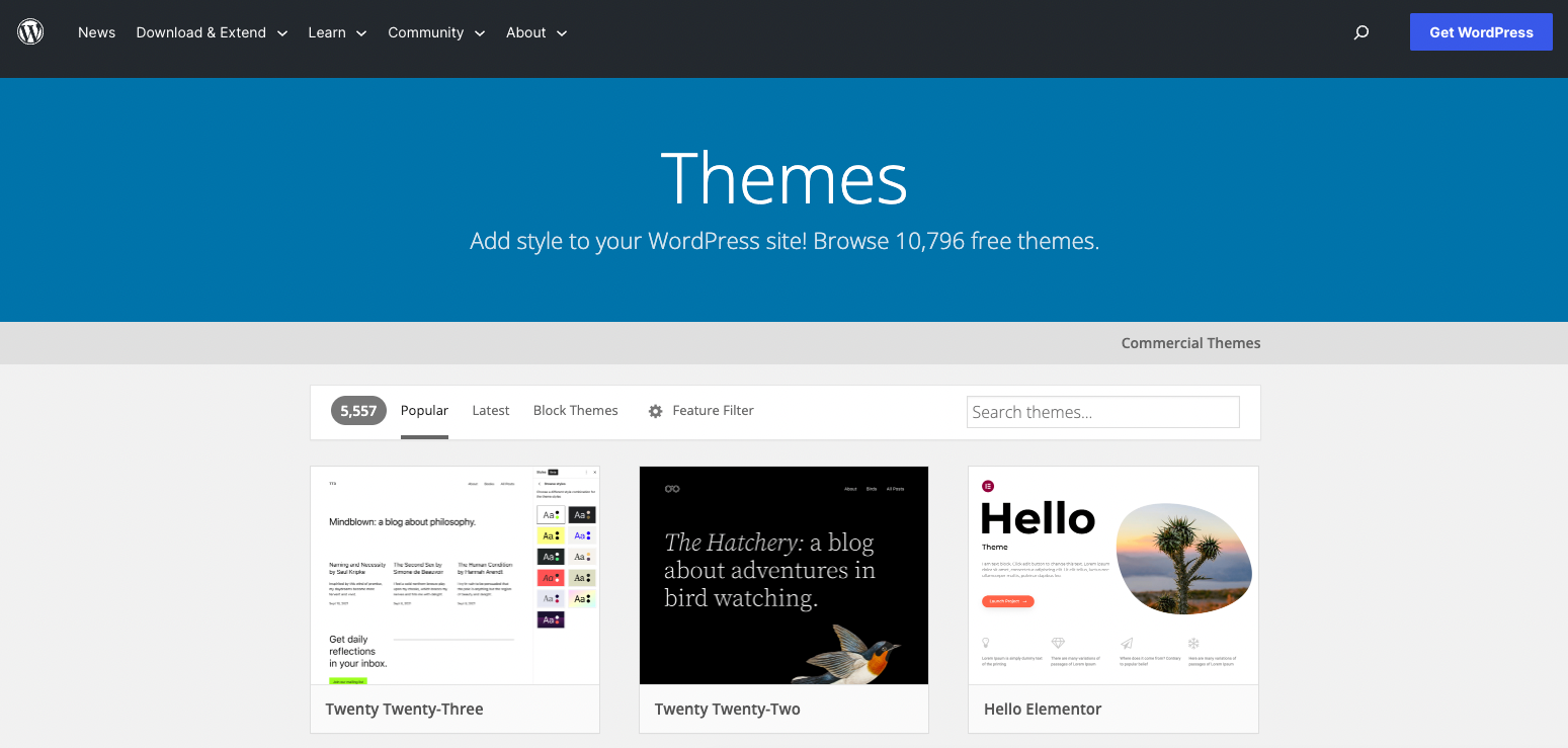
Single-page websites find diverse applications, ranging from selling a singular product and promoting events to showcasing professional services.
Moreover, if you operate a small business or restaurant, it is likely feasible to encompass all the essential information required by customers within a single page.
If you want to start your own website we have guides about, domain names, hosting, and WordPress.
1. Divi
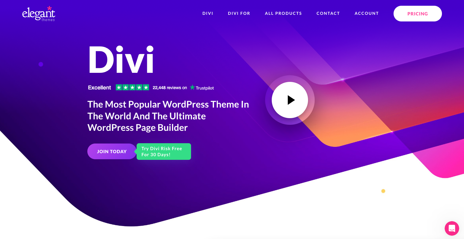
Divi, an exceptional WordPress theme and robust website builder, offers a wealth of features. It provides numerous layout packs and a 1-click demo content importer, enabling users to swiftly commence their website development journey.
This theme includes an extensive collection of single-page website templates tailored to various business niches. With a vast array of elements and hundreds of pre-made designs, Divi offers abundant options to create a personalized and visually captivating website. Its user-friendly customization panel facilitates easy setup and configuration.
Moreover, Divi seamlessly integrates with popular and premium WordPress plugins, enhancing its functionality and versatility.
Additionally, the theme is optimized for search engines, ensuring your website benefits from solid SEO practices, potentially leading to higher rankings on platforms like Google.
Pricing of Divi
Pricing of Divi starts at $89 per year or a one-time payment of $249 for lifetime access. Do not worry, they offer 30-day money-back guarantee.
2. OceanWP
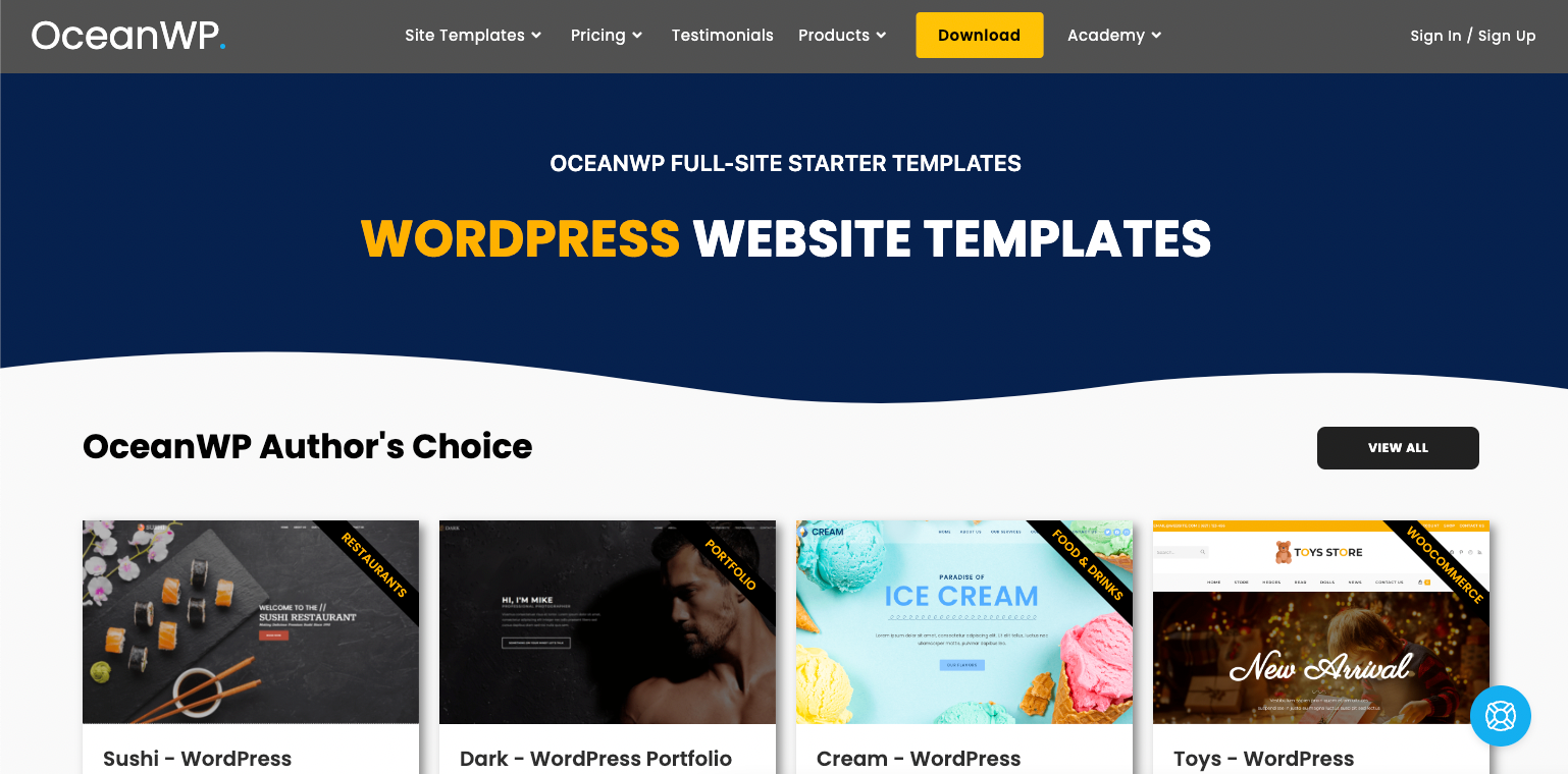
OceanWP, a versatile WordPress theme, offers extensive functionalities and is an excellent option for startups and companies operating with limited financial resources. As a free theme, it allows users to make the most of its features without straining their budget.
Notably, OceanWP boasts a remarkable page load speed, ensuring an efficient and seamless user experience. The theme also incorporates built-in SEO optimization, enhancing your website’s visibility and potential rankings on popular search engines like Google.
With OceanWP, users gain access to an assortment of free and premium website demos, simplifying the website creation process. The 1-click demo content importer further streamlines the setup, allowing users to swiftly import and customize their desired demo content.
Additionally, the theme offers powerful extensions, expanding its functionality and customization options.
Furthermore, OceanWP provides multiple one-page templates suitable for a variety of purposes, including websites, blogs, and eCommerce stores. This wide selection ensures that users can find a template that aligns with their specific needs and design preferences.
Pricing of OceanWP
OceanWP’s pricing for the Personal plan starts at $38 per year or $155 for lifetime access. You can download the core theme for free on WordPress‘s site. They also offer a 14-day money-back guarantee.
3. One Page Express
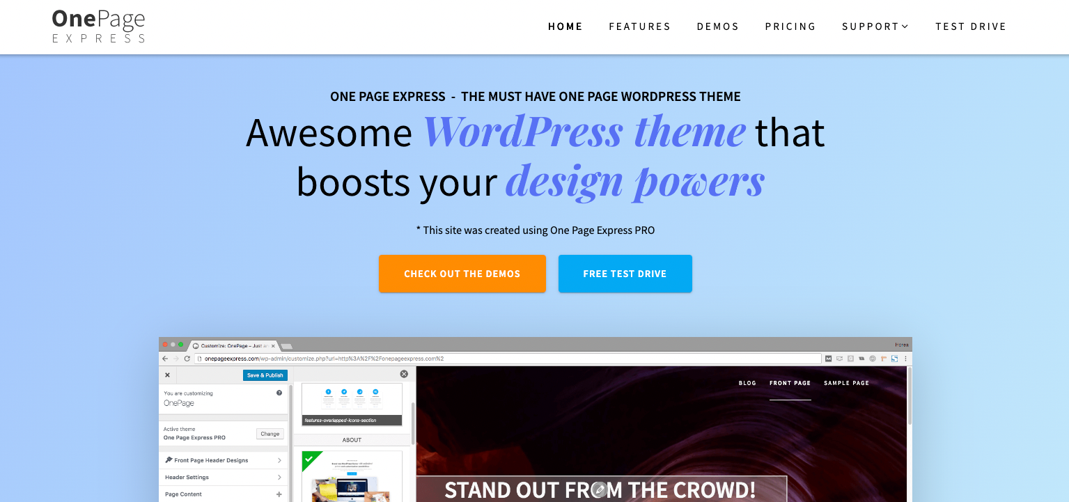
One Page Express is a complimentary WordPress theme designed specifically for small businesses and online agencies, emphasizing simplicity and effectiveness.
With its striking color design, the theme instantly captures attention. It features a built-in homepage, facilitating easy navigation for visitors, and allows for a custom background, enabling the addition of engaging video or image sliders.
This theme encompasses numerous pre-designed content sections that can be readily implemented on the homepage and other landing pages of the website. By incorporating drag-and-drop builders, One Page Express ensures swift and intuitive customization, empowering users to personalize their site according to their preferences and branding.
Pricing of One Page Express
Pricing of One Page Express starts at $79 per year or $169 for a lifetime Personal plan. There is a free version available with some limitations. They give a 14-day money-back guarantee.
4. Coastline
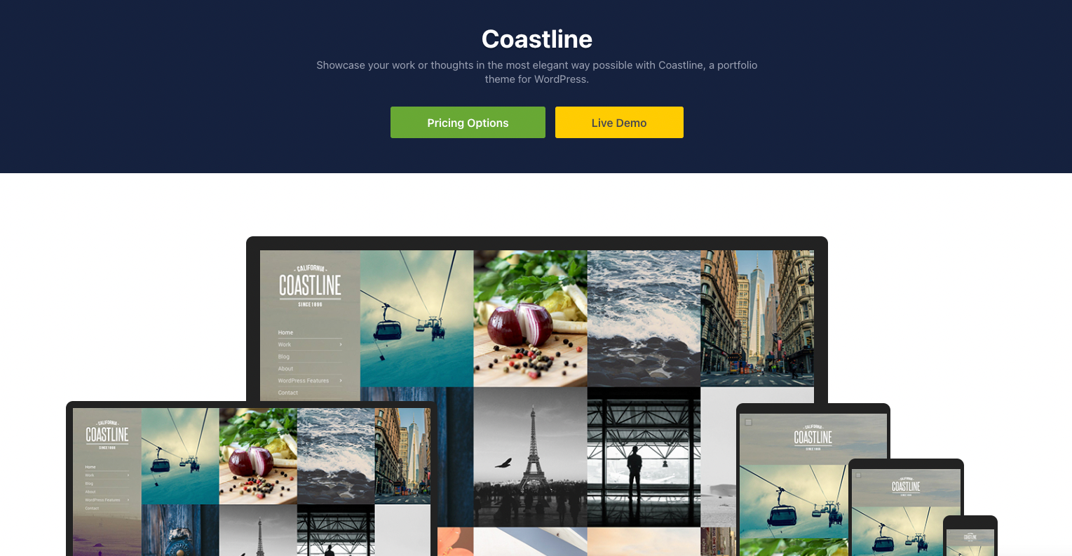
Coastline represents a sophisticated WordPress portfolio theme specifically designed to cater to the needs of photographers and creative artists seeking an online platform to showcase their work. Its exquisite layout presents a captivating arrangement, featuring a left-side navigation menu and your photography prominently displayed on the right side of the screen.
This theme incorporates a built-in portfolio management system, offering seamless compatibility with popular page builders such as Beaver Builder or Elementor. This integration allows for effortless management and organization of your portfolio content, ensuring a smooth and efficient workflow.
Furthermore, Coastline provides support for WooCommerce, enabling users to effortlessly sell their art and facilitate online payments. With this integration, artists can showcase their creations and engage in e-commerce activities, offering a convenient and comprehensive solution within the same theme.
Pricing of Coastline
Coastline’s pricing starts at $49 per year for the theme only. If you wish to access to all themes and plugins the Standard Club plan starts at $69 per year. They also offer a Lifetime Club plan for a one-time payment of $249. They give a 30-day money-back guarantee.
8 Key Features and Characteristics of a One-Page Site
1. Simplified Structure
One-page websites typically have a simple and straightforward structure. They eliminate the need for multiple pages and menus, resulting in a streamlined user experience for site visitors.
2. Vertical Scrolling
Instead of clicking on links to navigate between pages, users can simply scroll vertically to access different sections of the website. Each section may contain distinct content, such as an introduction, services, portfolio, testimonials, contact information, and more.
3. Visual Storytelling
One-page websites often rely heavily on visuals to convey information and tell a story. They may have large images, videos, animations, and interactive elements to engage visitors and create a visually attractive experience.
4. Responsive Design
Given the long-scrolling nature of one-page websites, they are usually designed to be responsive, so they adapt to different screen sizes and devices. This allows for a consistent and optimized experience across desktops, tablets, and smartphones.
5. Parallax Scrolling
Parallax scrolling is a popular technique in one-page websites. It creates an illusion of depth by moving background elements at a different speed than the foreground, resulting in a visually dynamic and engaging effect as users scroll.
6. Clear Call-to-Action
One-page websites often have a specific goal or call-to-action, such as encouraging visitors to sign up for a service, make a purchase, or contact the business. These calls-to-actions are typically placed prominently throughout the page to drive conversions.
7. Faster Load Times
Since one-page websites have a limited amount of content, they tend to load faster compared to multi-page websites. This can contribute to a better user experience and reduce bounce rates.
8. Simplicity and Focus
One-page websites prioritize simplicity and focus. By presenting information concisely on a single page, they aim to eliminate distractions and guide visitors toward the intended message or action.
Conclusion
In conclusion, one-page websites offer a simplified and streamlined approach to web design, presenting all essential content and information on a single, long-scrolling page. They are particularly effective for showcasing portfolios, promoting small businesses, launching products, and creating engaging landing pages.
By eliminating the need for multiple interconnected pages, one-page websites provide a focused user experience, enabling visitors to navigate through different sections seamlessly. The use of visual storytelling, parallax scrolling, and responsive design enhances their appeal and engagement.
While one-page websites may not be suitable for content-heavy sites or those requiring complex navigation, they excel in delivering concise and impactful messages. They optimize load times, provide clear calls to action, and can be efficiently optimized for search engines.
Whether you’re an artist, freelancer, small business owner, or event organizer, one-page websites offer an opportunity to present information in a visually compelling and user-friendly manner. They simplify the user journey, streamline conversions, and provide an immersive experience for visitors.
Consider the unique goals and content requirements of your project, and leverage the benefits of a one-page website to captivate your audience, convey your message effectively, and achieve your desired outcomes.
FAQ
A one-pager is a website that presents all its content and information on a single web page, eliminating the need for multiple interconnected pages. Users can scroll vertically or use navigation links to access different page sections.
One-page websites can be optimized for search engines, but they may have limitations compared to multi-page websites. Since all content is on a single page, keyword targeting, and content organization become crucial. It’s important to ensure relevant keywords, meta tags, and headings are appropriately utilized throughout the page.
Users navigate a one-page website by scrolling vertically through the site or using navigation links or buttons that lead to different sections. The sections are typically accessed through anchor links that allow users to jump to a specific part of the page.
While one-pagers are designed for concise content, it is possible to incorporate a significant amount of information by utilizing expandable sections or accordions. These interactive elements can help manage and present a larger volume of content in a user-friendly manner.
